zrz-nav-box
Demo
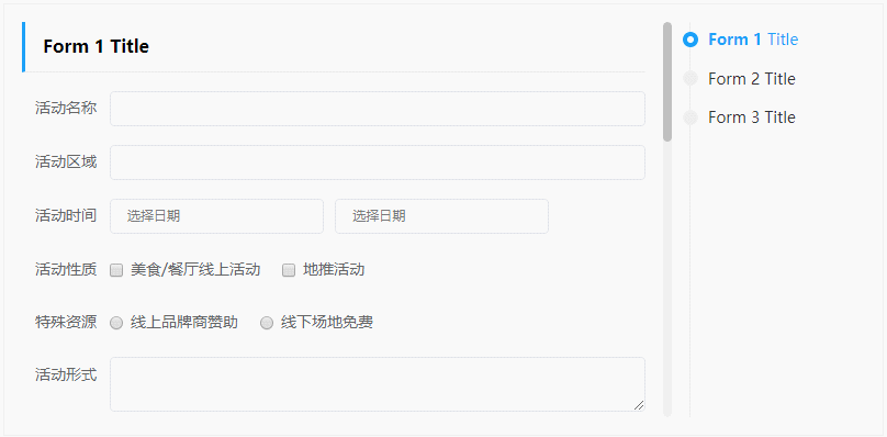
https://zhangr16.github.io/zrz-nav-box/
Preview
Usage
<template>
  <nav-box height="360px" :foldable="true">
    <nav-box-pane>
      <div slot="title">Form 1 <strong style="color:#f90">(Html surport)</strong></div>
      <!-- <example-form /> -->
    </nav-box-pane>
    <nav-box-pane title="Form 2 (Fold by default)" :fold="true">
      <!-- <example-form /> -->
    </nav-box-pane>
    <nav-box-pane title="Form 3 (Can't fold)" :foldable="false">
      <!-- <example-form /> -->
    </nav-box-pane>
  </nav-box>
</template>

<script>
import { NavBox, NavBoxPane } from '@zrz-nav-box'

export default {
  components: {
    NavBox,
    NavBoxPane
  }
}
</script>
Props
nav-box
| Prop | Type | Default | Info |
|---|---|---|---|
| height | String, Number | null | Navigation wrap box’s height. e.g. 500, 500px |
| navWidth | String, Number | null | Navigation sidebar width. e.g. 160, 160px |
| duration | Number | 400 | Scroll animation time. |
| offsetTop | Number | 0 | Amount of space between top of screen and the section to active. |
| foldable | Boolean | false | Enable child panes foldable |
nav-box-pane
<nav-box-pane /> needs to wrap in the <nav-box />
| Prop | Type | Default | Info |
|---|---|---|---|
| title | String | null | Section title |
| foldable | Boolean | - | Specify the child pane foldable. Only on <nav-box /> foldable is true |
| fold | Boolean | - | Specify the child pane whether fold by default. Only on <nav-box /> foldable is true |
Project scrips
# Develop
yarn run serve

# Build component dist
yarn run build:lib

# Build example page
yarn run build:example